Chapperone
is a mobile app that allows educators to create school trips that are easy and safe for their students. Once the school trip and the itinerary have been created, the parents/students can join through a code. I’ve collaborated with the Chapperone team to redesign and improve the user flow of the app.
Goals
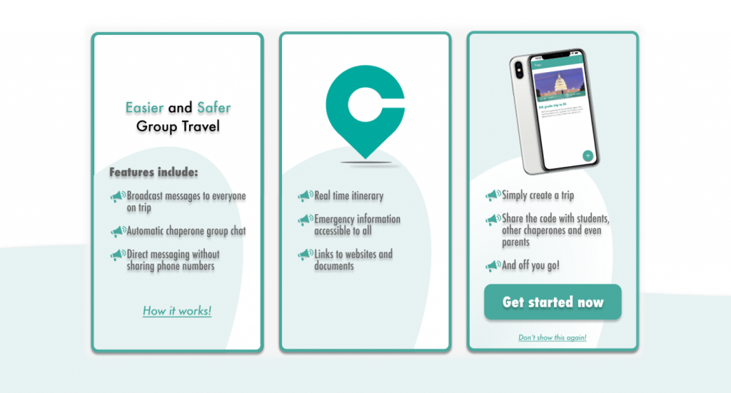
- Make student travel safer, easier and more engaging by reducing the stress and risk for teachers
- Enable students to explore beyond the classroom and have authentic learning experiences in different settings
- Connect teachers with other educators, experts and resources that can enhance their field trip planning and execution
Problems
- Teachers have increased workload and stress in organizing the logistics of school trips
- Discipline problems, conflicts, accidents or emergencies that arise during a school trip.
Design
User Experience, User Interface
Usability Testing, Design System
Team: 2 product managers, 1 designer, 3 developers
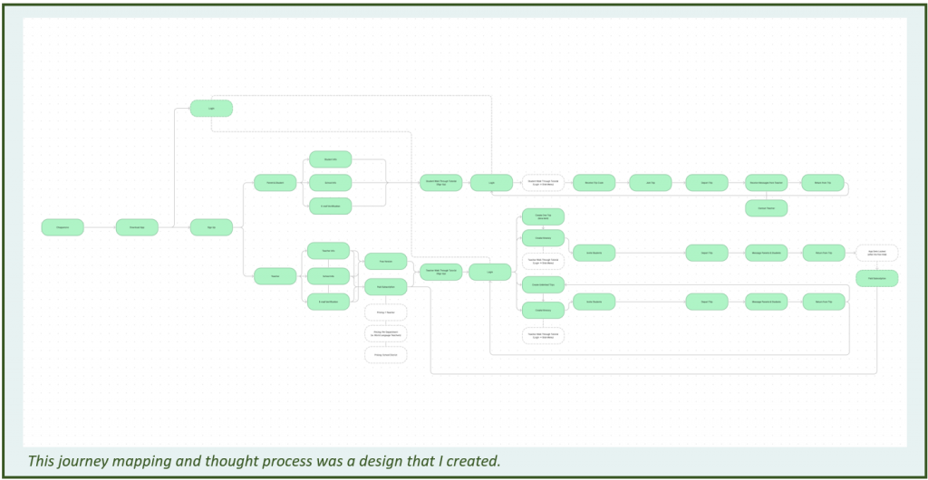
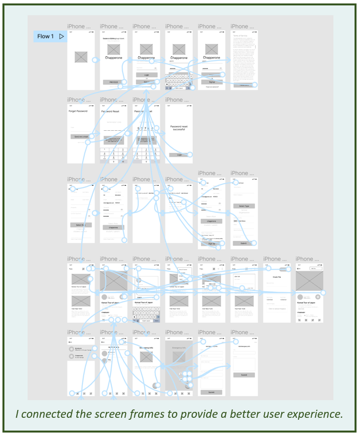
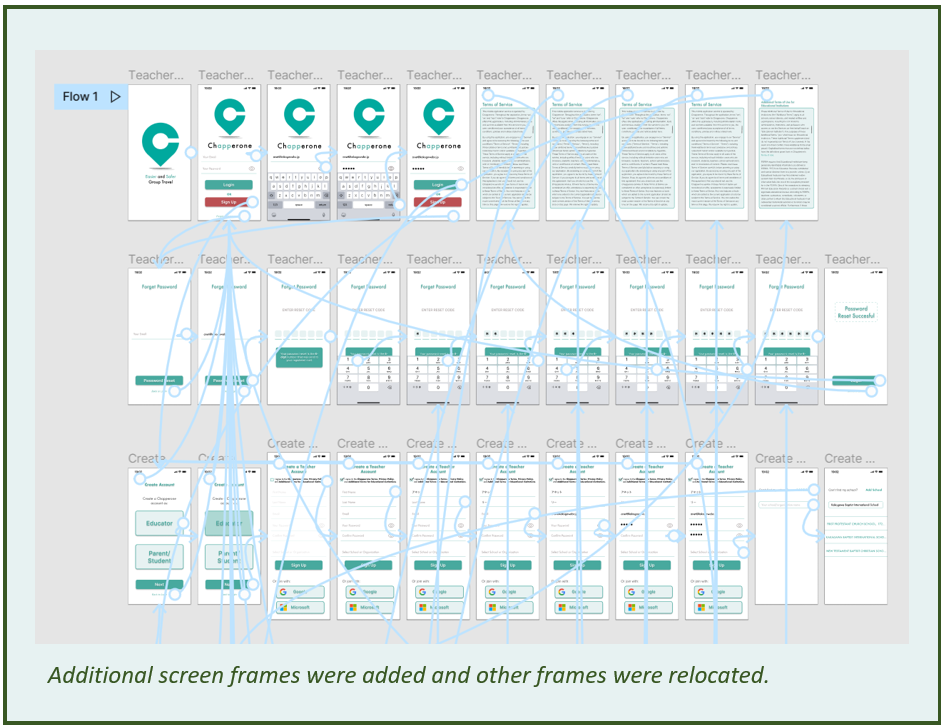
User Flow
I created a separate mapping flow between the educator experience and the parent/student experience as they use the app.
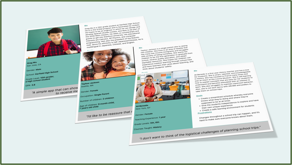
Personas
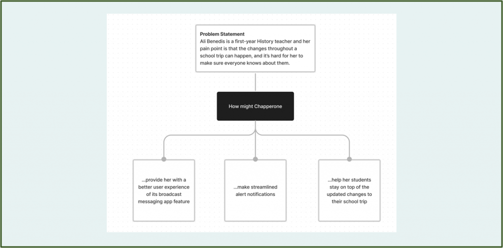
Identifying the Challenges
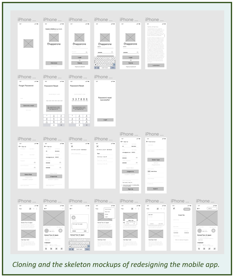
Design Mockups
I had the opportunity to develop the wireframing screens, collaborate with the product managers on potential solutions, and improve the design iteration process.
Their beta app had a poor user experience and many functionality errors. For example, the sign-up process, the trip/itinerary creation, and other features had to be changed.
Low-fidelity prototype
I showed the user flow of using this low-fidelity prototype design to my product managers. Then, I received feedback on how to move forward with the app improvement.
.
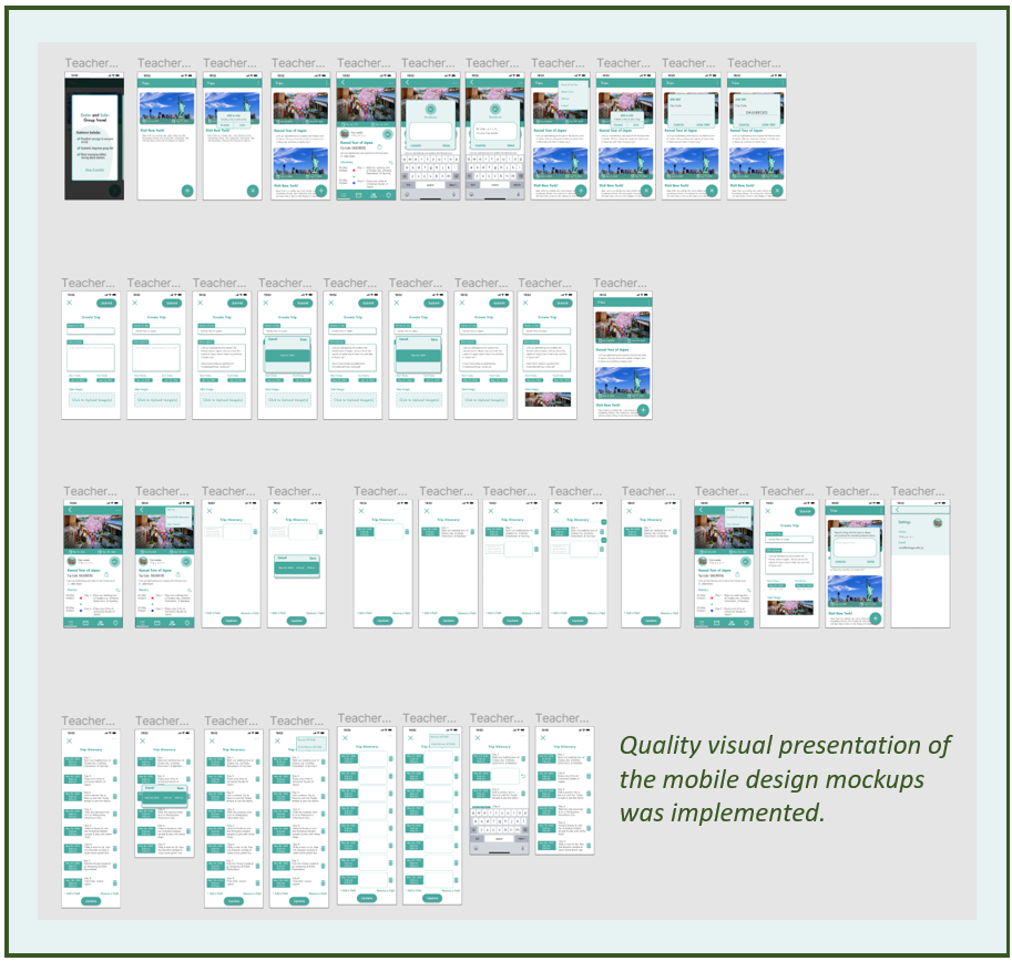
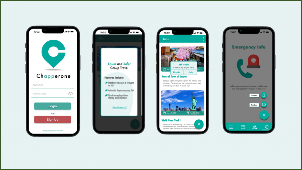
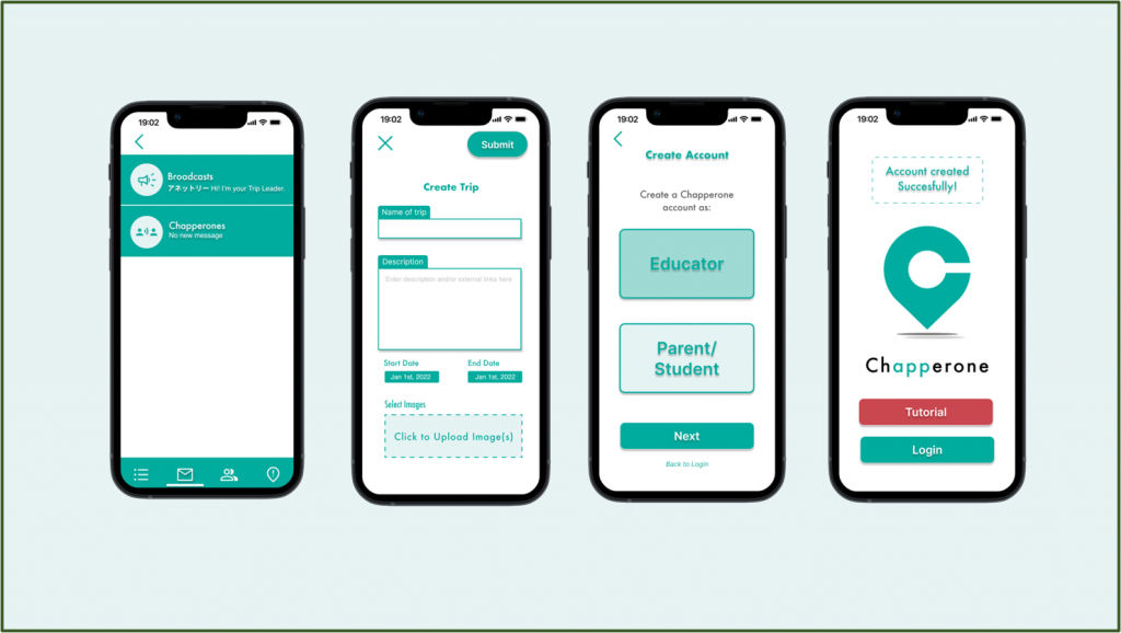
Design Mockups
Several high-fidelity mockups were developed as I went through refining the iterations. I added onboard tutorial screens and the intro screens of the app’s features.
I also solved the sign-up registration process to distinguish between educators and parents/students. Their beta app had them together.
Furthermore, I addressed the issue of some users not fully using the app’s features and benefits. I did this by adding an interactive onboard tutorial.
High-fidelity
prototype
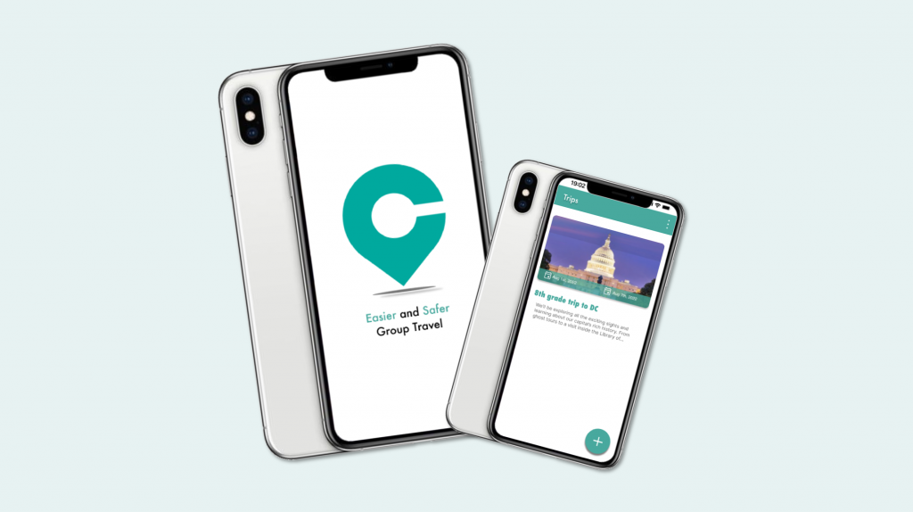
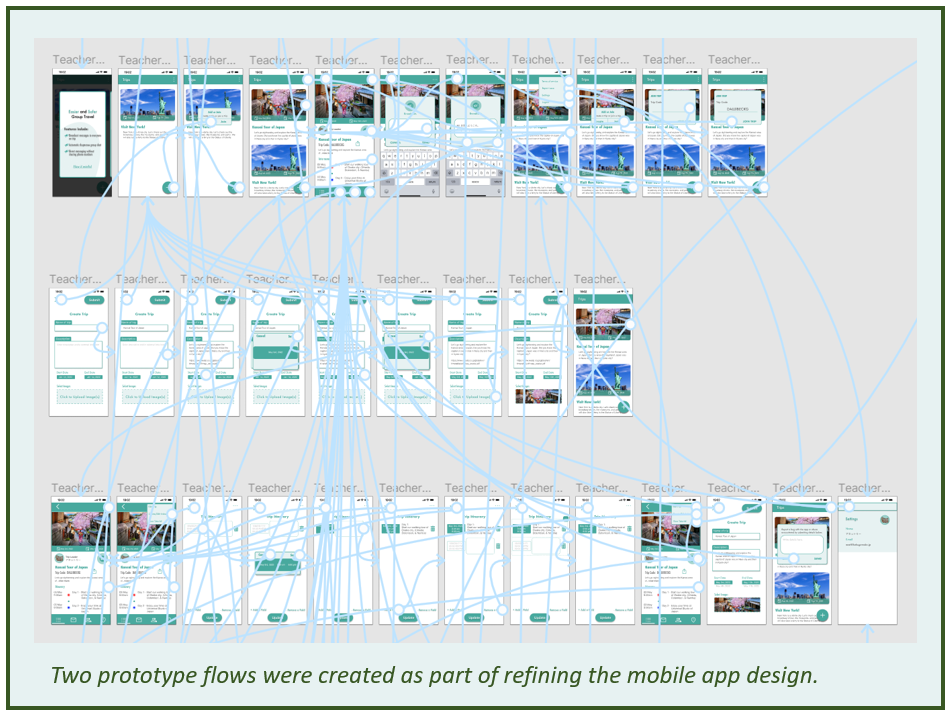
I improved the user interface by creating several iterations of the high-fidelity prototype.
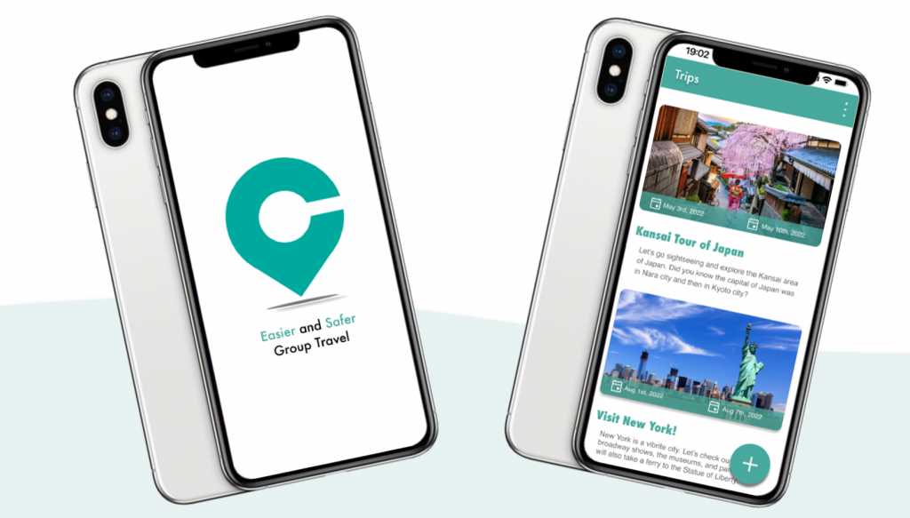
The high-fidelity prototypes showed how the users would experience the app. The app began with a flash screen and then the login registration. Next, the user could learn from the onboard guided tutorial and finally, they could plan their own school trip. The app also had safety features like broadcast messages, contact details, and emergency alerts.
High-fidelity
prototype
During the designing of the mid-fidelity prototype, I asked four users to participate in my usability testing. I discovered its shortcomings and continued to work on improvements, as well to meet my product managers’ requests.
In its final design, I made two flows of the high-fidelity prototype. One was for the educator and the other was for the parent/student.
Click on these links to see the prototype:
Takeaway of What I Learned
The opportunity I gained from this internship was a valuable experience because I could work alongside with my product managers and team members. I was thankful that I could use my talented skills to produce excellent and quality UI/UX designs.
As for the insights of learning about the Chapperone app, it allowed me to think of better user flow designs. I also conducted a research usability testing to refine the design iterations. The iterations helped improve the overall navigation experience and engagement.