
Chapperone: Make School Trips Safer
PowerPoint Presentation: Chapperone
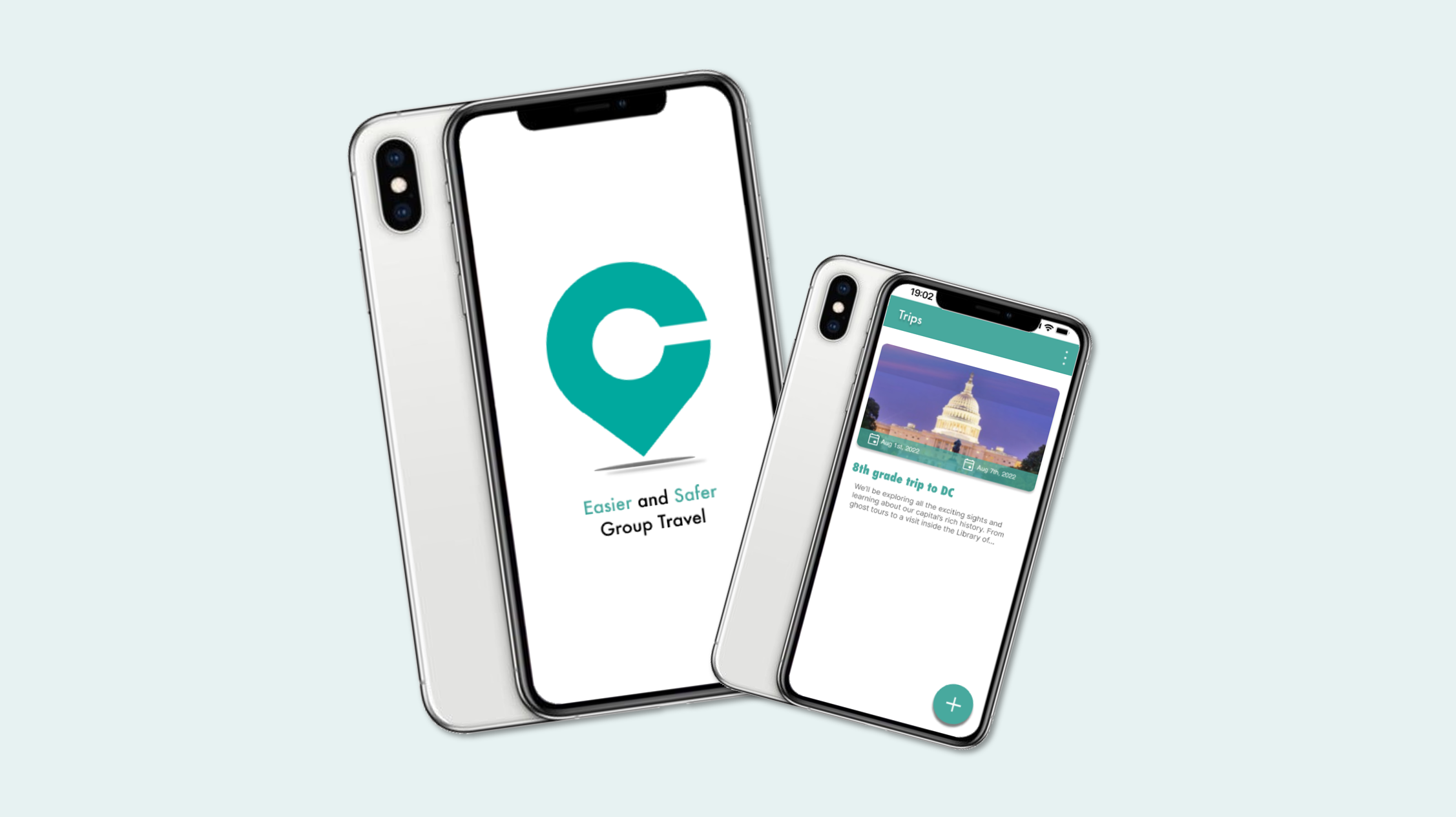
Chapperone
It is a mobile app designed for school educators, making group student trips safer, more secure, and easier. Educators can effortlessly create school trips and plan itineraries. It can easily connect with students, other chaperones, and families. This simplifies the complexities of organizing student trips, allowing educators to focus on creating enriching experiences for their students.
As part of the Chapperone intern team, my role involved redesigning and enhancing the user flow within the app. By refining the app’s navigation, interactions, and visual elements, I aimed to make Chapperone an indispensable tool for organizing safe and memorable school trips.
Goals
Make student travel safer, easier and more engaging by reducing the stress and risk for teachers
Enable students to explore beyond the classroom and have authentic learning experiences in different settings
Connect teachers with other educators, experts and resources that can enhance their field trip planning and execution
Problems
Teachers struggle with time‑consuming logistics such as tracking students, coordinating chaperones, and managing permissions
Educators face stress and uncertainty when handling unexpected situations like discipline issues, emergencies, or lost students
Communication between teachers, students, and families is fragmented or inconsistent during trips
Students may miss important information or instructions, increasing risk and confusion
Design
User Experience, User Interface
Usability Testing, Design System
Team: 2 product managers, 1 designer,
3 developers
User Flow

Click on this link to view a comprehensive mapping of this user flow.
To redesign Chapperone’s experience, I began by mapping out two distinct user flows: one for educators and another for parents and students. Although both groups interact with the same trip ecosystem, their needs, responsibilities, and mental models are fundamentally different.
By separating these flows, I was able to design interactions that feel intuitive and purposeful for each audience. Educators move through a streamlined path that supports creating trips, organizing itineraries, coordinating chaperones, and monitoring student safety. Meanwhile, parents and students follow a simplified flow focused on receiving updates, viewing schedules, and staying connected throughout the trip.
This dual‑flow approach ensures that every user encounters only what is relevant to them, reducing cognitive load and making the app feel more personal, efficient, and supportive during every stage of a school trip.
Personas


I created three core personas—educator, parent, and student—to understand the different needs involved in school trips. Educators prioritize safety, organization, and clear coordination. Parents look for transparency and timely updates. Students want simple access to schedules and trip information. These perspectives guided the design toward an experience that supports every user involved in a school trip.
Identifying the Challenges

Lo-fi Design Wireframes

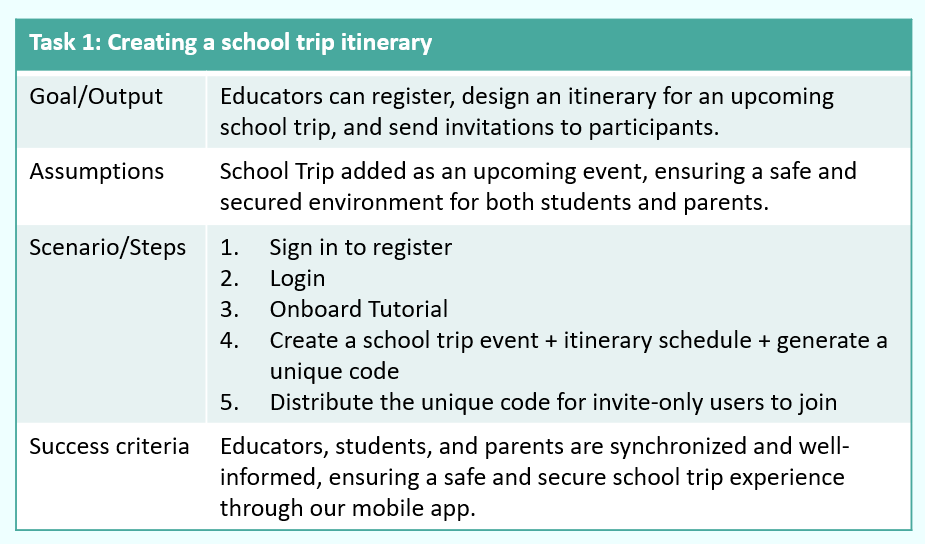
I contributed directly to creating the app’s low‑fidelity wireframes, which served as the foundation for defining layout, structure, and core functionality. Working closely with product managers, I explored multiple design directions to address key usability issues and simplify complex interactions. Through iterative refinement, I focused on improving the sign‑up flow, trip and itinerary creation, and other essential features. These early wireframes helped us validate ideas quickly and move toward a more intuitive, streamlined experience for all users.
Lo-fi Prototype
I presented the low‑fidelity prototype and its user flows to the product managers to validate our early design decisions. Their feedback helped clarify priorities and highlight areas that needed refinement. By integrating their insights, we iterated on the prototype to improve clarity, reduce friction, and move closer to a more intuitive and user‑friendly experience

Primary Colors

Hi-fi Design Mockups
As the design evolved, I created a series of high‑fidelity mockups to define the app’s visual identity and refine key interactions. These screens brought clarity to the interface, illustrating how users would navigate features and complete essential tasks.
A major focus was improving onboarding. I introduced guided tutorial screens and feature‑specific intros to help users understand the app from the moment they sign in. I also redesigned the registration flow to clearly separate educator and parent/student roles, resolving confusion that existed in the beta version.
To increase engagement, I developed an interactive onboarding tutorial that encourages users to explore the app’s capabilities and understand how Chapperone supports their trip experience. These enhancements collectively shaped a more intuitive, welcoming, and user‑centered design.


Hi-fi Prototype

I refined the app’s interface through multiple iterations, developing high‑fidelity prototypes that demonstrated the final look, feel, and interactions. These prototypes helped validate the user experience and ensured the design aligned with user needs.
Flash Screen: The journey begins with an engaging flash screen that establishes the app’s visual identity and sets the tone for the experience.
Login Registration: I designed a streamlined login and registration flow with clear role separation for educators and parents/students. This resolved confusion from the beta version and made onboarding more intuitive.
Onboard Guided Tutorial: To support first‑time users, I introduced a guided tutorial that highlights key features and helps users understand how to navigate the app effectively.
School Trip Planning: For educators, the prototype showcases intuitive tools for creating itineraries, selecting destinations, and managing logistics. Parents and students can easily access trip details and stay informed throughout the experience.
Safety Features: Safety remained a core focus. I integrated broadcast messaging, emergency alerts, and accessible contact information to ensure users feel supported and secure during every stage of the trip.
Qualitative Usability Testing
During the mid–high fidelity prototype phase, I conducted qualitative usability testing with four users to evaluate how well the design supported real tasks. Their feedback revealed areas where the flow felt unclear or required too many steps, helping me pinpoint specific usability issues. Using these insights, I refined the prototype and aligned the updates with priorities set by my product managers. This iterative process strengthened the overall experience and ensured the design moved closer to meeting user expectations.


Hi-fi Prototype
In the final design, I developed two distinct user flows within the high‑fidelity prototype to ensure each audience received an experience tailored to their needs.
Educator Flow: This path was designed specifically for educators, offering seamless navigation and the full set of tools required to create and manage school trips. It highlights itinerary building, logistics, communication features, and safety controls.
Parent/Student Flow: This streamlined flow focused on clarity and ease of use, giving parents and students quick access to trip details, schedules, and updates. While lighter in features, it delivers a smooth and intuitive experience aligned with their role.
Click on these links to see the prototype:

Takeaway of what I learned
During my internship, I had the opportunity to work closely with product managers and cross‑functional team members, which strengthened my ability to collaborate and translate feedback into meaningful design decisions. Exploring the Chapperone app gave me deeper insight into user needs and inspired new ways to improve the overall flow and experience.
Through usability testing, I gathered real user feedback that guided iterative refinements to the interface. Each round of improvements made the app more intuitive, streamlined, and engaging.
Overall, this internship was a valuable experience that sharpened my UX/UI skills, expanded my understanding of user‑centered design, and allowed me to contribute to a product with real impact.

Design Mockups

