
Chapperone: Make School Trips Safer
PowerPoint Presentation: Chapperone
Overview
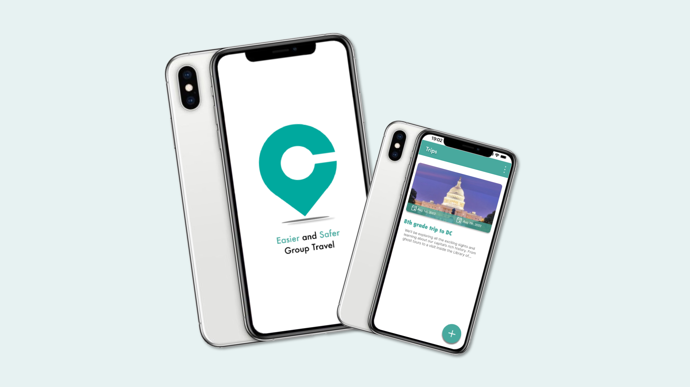
Project: Chapperone – Mobile app for safer, easier school trips
Role: UX/UI Designer (Intern)
Team: 2 PMs, 1 designer, 3 developers
Focus: User flows, onboarding, navigation, visual design, usability testing
Goal: Improve clarity, reduce cognitive load, and streamline trip creation and communication for teachers, students, and parents.
The Problem
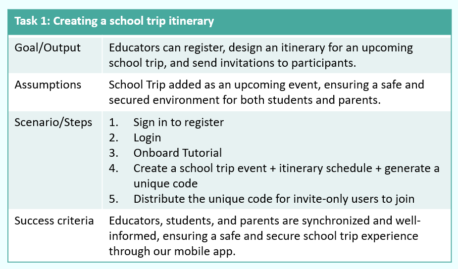
- Teachers struggle with the logistics of school trips — tracking students, coordinating chaperones, managing emergencies, and communicating updates.
- Parents lack transparency.
- Students miss important information.
The existing app had unclear flows, confusing onboarding, and inconsistent role separation.

User Flow

Click on this link to view a comprehensive mapping of this user flow.
Users & Research
I designed for three distinct groups:
- Educators: Need streamlined trip creation, itinerary management, and reliable communication tools.
- Parents: Need reassurance, real‑time updates, and easy access to emergency info.
- Students: Need simple schedules, alerts, and a way to contact teachers.
Mapping separate user flows revealed that each group had different mental models and needed tailored pathways.
Personas


Identifying the Challenges

Design Process – 1. Define

- Clarified educator vs. parent/student roles
- Identified friction in onboarding, trip creation, and broadcast messaging
- Prioritized safety features and communication clarity
2. Ideate
- Created low‑fidelity wireframes for trip creation, itinerary building, messaging, and emergency info
- Explored simplified navigation and clearer hierarchy
Lo-fi Prototype

Primary Colors

3. Design
- Built high‑fidelity mockups with improved onboarding, guided tutorials, and role‑specific flows
- Introduced clearer trip cards, itinerary layouts, and broadcast messaging screens
- Refined visual system to match brand identity

Hi-fi Prototype


4. Test
Conducted qualitative usability testing with 4 users.
Key insights:
- Users wanted fewer steps in trip creation
- Messaging needed clearer entry points
- Itinerary needed stronger visual hierarchy
5. Iterate
- Reduced steps in onboarding
- Improved clarity of trip creation flow
- Strengthened emergency info visibility
- Added interactive tutorial screens
Qualitative Usability Testing


Final Designs
The final prototype included:
- Role‑specific onboarding for educators vs. parents/students
- Streamlined trip creation with clearer forms and image selection
- Real‑time itinerary with consistent formatting
- Broadcast messaging for quick alerts
- Emergency info module accessible to all users
- Interactive guided tutorial to reduce confusion for first‑time users
These changes created a more intuitive, supportive experience across all user types.
Click on these links to see the prototype:

Impact & Reflection
This internship strengthened my ability to:
- Collaborate with PMs and developers
- Translate feedback into actionable design decisions
- Conduct usability testing and iterate quickly
- Design for safety, clarity, and multi‑role experiences
The redesigned flows reduced cognitive load, improved communication clarity, and made the app feel more trustworthy and usable during real school trips.

Design Mockups

