
Asian Service Center

PowerPoint Presentation: Asian Service Center
Overview
Test Site: https://asianservicecenterwa.dreamhosters.com
Project: Asian Service Center (ASC) — Nonprofit website redesign
Role: UX/UI Designer, Researcher, Content Strategist
Team: Board members, Executive Director, Digital Experience Designer
Focus: UX research, information architecture, usability, content clarity, visual design
Goal: Modernize ASC’s website, clarify services, improve community engagement, and strengthen donor visibility.
The Problem
ASC is a new nonprofit serving Asian and underserved communities in Snohomish County. Their original website:
- Was too general and unclear
- Failed Google AdSense grant requirements
- Did not highlight services effectively
- Buried the Donate button
- Lacked secure contact information
- Did not reflect cultural diversity or community needs
Community members struggled to understand what ASC offered, and donors couldn’t see the organization’s impact.
Users & Research
I designed for four community groups:
1. Immigrant Adults
- Need healthcare access, translation, ESL, and job support
- Struggle with navigating U.S. systems
2. Seniors
- Need companionship, transportation, and culturally familiar support
- Often face language barriers and isolation
3. Families
- Need counseling, financial guidance, citizenship help, and stability resources
4. Youth
- Need academic support, leadership programs, and cultural connection
Personas


Identifying the Challenges

User Flow

Competitive Analysis

Quantitative Research Overview
I conducted a survey with 140+ participants and observed seniors at the Homage Center.
Key insights:
- Asian communities are not monolithic — Chinese, Korean, Filipino, Thai, and others have distinct needs
- Lack of interpreters and culturally aligned healthcare
- Confusion navigating government systems
- Desire for community belonging and culturally familiar programs
These insights shaped a culturally responsive UX direction.
For a detailed breakdown of the data, please refer to the

Design Process – 1. Define

- Identified gaps in clarity, navigation, and cultural relevance
- Mapped four core service areas: Healthcare, Senior Care, Family Support, Youth Development
- Prioritized accessibility, trust‑building, and donor visibility
2. Ideate
- Created low‑fidelity wireframes for homepage, service pages, events, and contact flow
- Introduced intuitive graphic buttons and universal imagery for multilingual users
- Reorganized content into clear pathways based on real user needs
Primary Colors


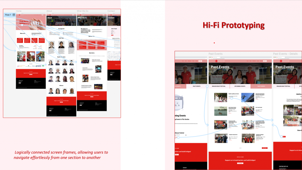
3. Design

Built high‑fidelity mockups with:
- A modern, culturally resonant color palette
- Clear service descriptions
- Prominent Donate button
- Dedicated event pages (instead of one long list)
- Infographic icons for universal comprehension
- Clean typography for seniors and multilingual users
Usability Testing

4. Test
Usability feedback revealed:
- Users needed clearer service categories
- Seniors preferred simple layouts with fewer steps
- Donors needed more visibility into ASC’s mission and impact
- Multilingual users relied heavily on imagery
5. Iterate
- Simplified navigation
- Strengthened visual hierarchy
- Added culturally inclusive imagery
- Improved event categorization
- Enhanced donation pathways

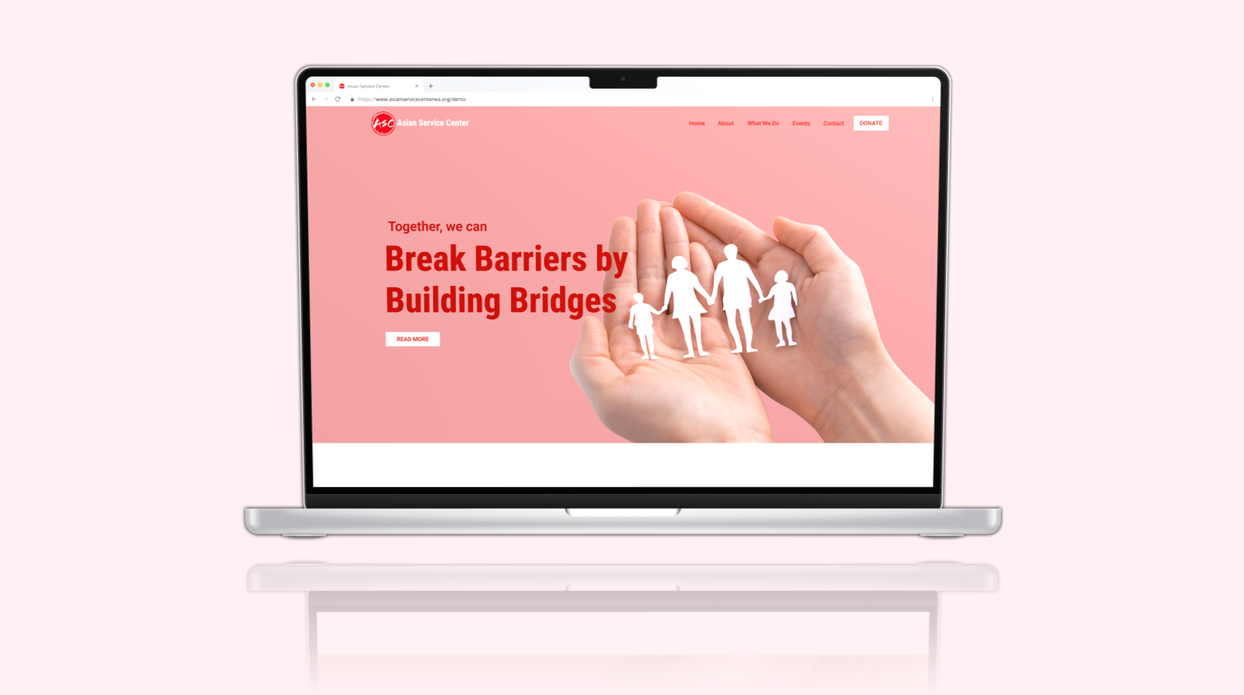
Final Designs
The redesigned website includes:
- Clear service pathways for healthcare, senior care, family support, and youth development
- Modern, culturally aligned visual identity
- Dedicated event pages for upcoming and past events
- Prominent donation and partnership CTAs
- Culturally sensitive icons and imagery
- Accessible layouts for seniors and multilingual users
- Secure contact information and improved trust signals
These changes help ASC communicate its mission clearly and serve community members more effectively.
Impact & Future Outlook
This project strengthened ASC’s ability to reach underserved communities and donors. Key outcomes:
- Clearer communication of services
- Stronger donor engagement through improved visibility
- More culturally responsive design for diverse Asian communities
- Better navigation for seniors and multilingual users
- A modern, trustworthy digital presence for a new nonprofit
This project deepened my understanding of designing for multicultural communities, nonprofit constraints, and the importance of culturally aware UX. It also reinforced how empathy, research, and clarity can transform community access and support.


